
Helpful Paws
Re-design of the local non-profit organization to better serve as an information resource and community support for people with disabilities who use service dogs.
Non-Profit Website Redesign
Psychiatric Service Dog Partners is a local non-profit organization that is creating valuable change by promoting the mental health of people who use service dogs. And by advocating, educating, and promoting responsible service dog handling and training. This is an important cause that could certainly use more attention and recognition. We feel that a new and improved website could help draw in new visitors which will increase awareness and donations to the organization.
The Solution
Create hierarchy;
New UI components;
Improve the flow of information;
Clear navigation elements.
The Problem
Unclear hierarchy;
Dense information on the home page;
Small fonts;
Unclear navigation system.
My Role: UX/UI Designer
Disciplines: User Experience Design (UI/UX), Information Architecture, Interaction Design, Prototyping, Usability Testing
Tools: Adobe XD, Figma, InVision, Miro
Time: 4 weeks
The Design Process
-

User Research
-

Definition & Ideation
-

Information Architecture
-

Prototyping & Testing
-

UI Design
USER RESEARCH & ANALYSIS
COMPETITOR ANALYSIS
We started by analyzing PSDP’s competition to learn the strongest and weakest parts of the organization and website in general. We found 3 competitors on the market and sorted findings by the following criteria - product analysis, feature list, strengths, weaknesses, customer reviews.

RESEARCH OBJECTIVE
As a user researcher, I want to understand how owners (or potential owners) of psychiatric service dogs acquire information about rights and protections as well as discover more about the benefits and process of owning a psychiatric service dog.
METHODOLOGY
User interviews were conducted to collect qualitative data from participants. The user tests were conducted digitally through Zoom. An affinity diagram and empathy map were created using this data and were used to help identify a user persona.
PARTICIPANTS
The ideal participants will consist of people who use, have used, or are considering using a service dog. These participants helped understand what information may not be well known and how best to present resources to support them.
Key Survey Data
80% have never owned a service animal;
60% would read online as their first step to learning more;
30% are confident in the process of acquiring a service animal.
Key Interview Insights
3 of 3 participants were not informed on
the laws and regulations;
2 of 3 participants have seen the
benefits first-hand.
Based on my gathered research data, I formulated the following Persona:

DEFINITION & IDEATION
After synthesizing the research data we defined the problem statement:
Psychiatric Service Dog Partners was designed to provide support for people using psychiatric service dogs and those interested by educating and offering expertise and resources.
We have observed that this website isn’t adequately conveying the goals of Psychiatric Service Dog Partners, which is causing a loss of interest to the organization. How might we improve the website so that visitors are quickly able to navigate to and locate the information that they need?
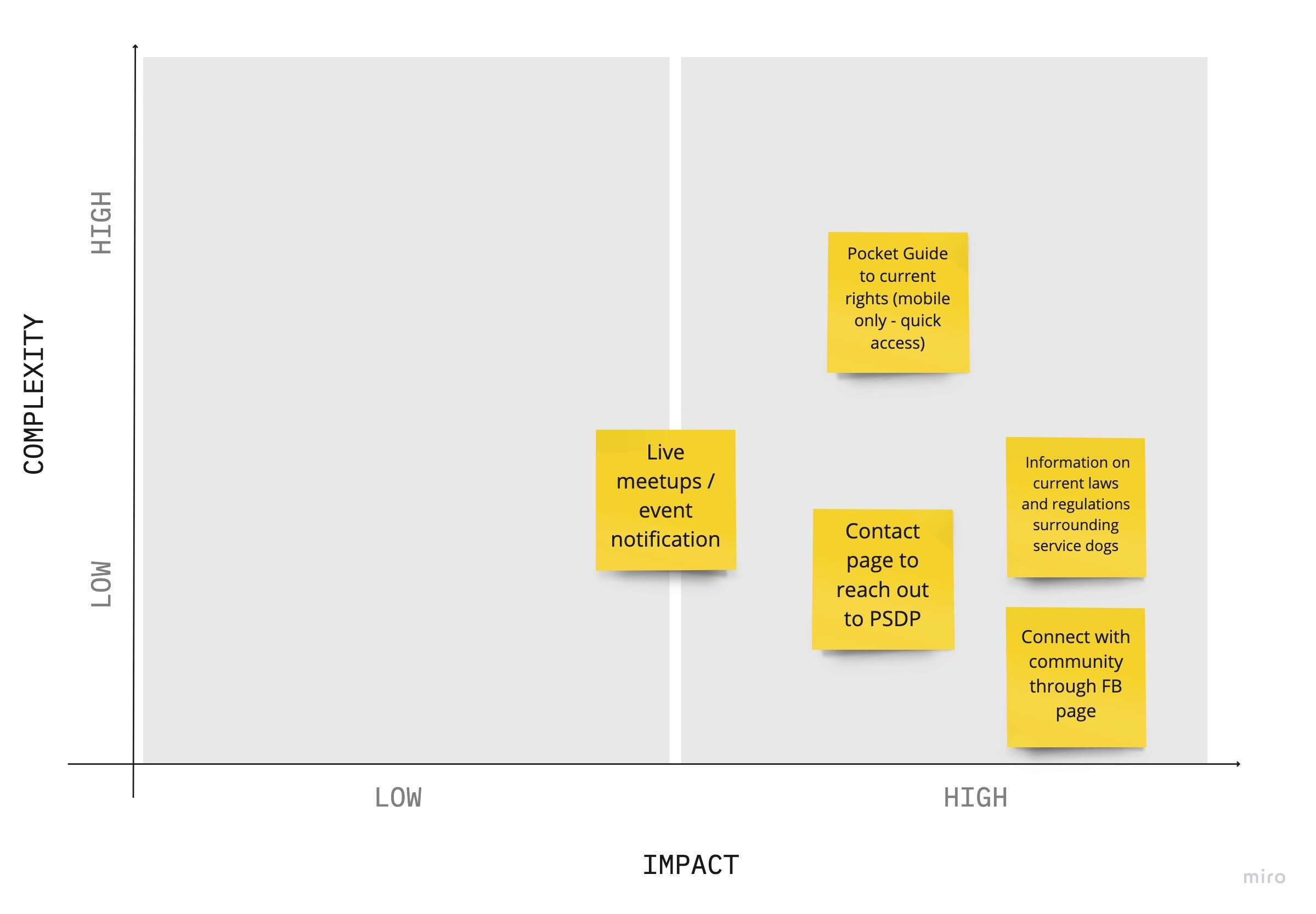
FEATURE PRIORITIZATION MATRIX
We analyzed user research data and conducted team ideation and brainstorming session. We started with “I Like, I Wish, What If Method”, then voted on the best brainstorming ideas and, finally, converted our thoughts to the Feature Prioritization Matrix.
USER SCENARIO
Mathew has struggled with anxiety for years but has decided to take action as his symptoms worsen. He never knew much about service dogs until he came across a client with pschiatric service dog and through brief conversation, learned of the different types and things they can help you with. He feels he may benefit from learning more and does a quick search for organizations in his area and finds Psychiatric Service Dog Partners. On the website he quickly learns about the benefits & rights associated with owning a psychiatric service dog. He’s suggested a few breeds that match with his lifestyle and goals and gets in touch with the organization on what to do next. Mathew is relieved and excited to take steps to combat his anxiety and already feels more empowered.
STORYBOARD

Based on our knowledge, we defined the value proposition for our user:
Psychiatric Service Dog Partners is redesigning their website to serve as an information resource and community support for people with disabilities who use service dogs, and people who are looking for information on service dogs.
We’re better because we provide accurate and clear information and design every detail specifically for people with disabilities and common accessibility concerns.
Psychiatric Service Dog Partners is believable because the organization is run by people with disabilities who are passionate about informing and being a community resource.
INFORMATION ARCHITECHTURE
Since the purpose of the redesign was to improve the information architecture of the website, we conducted Card Sorting to simplify the navigation process.
CARD SORTING
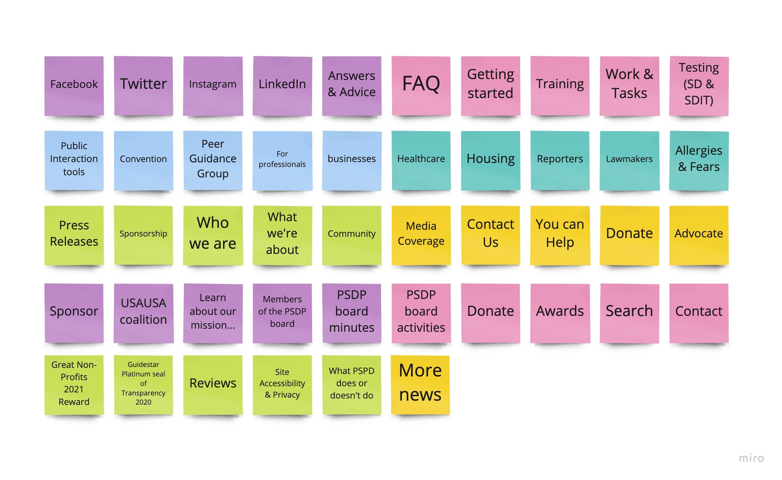
*Step 1: Define

*Step 2: Group
*Step 3: Structure
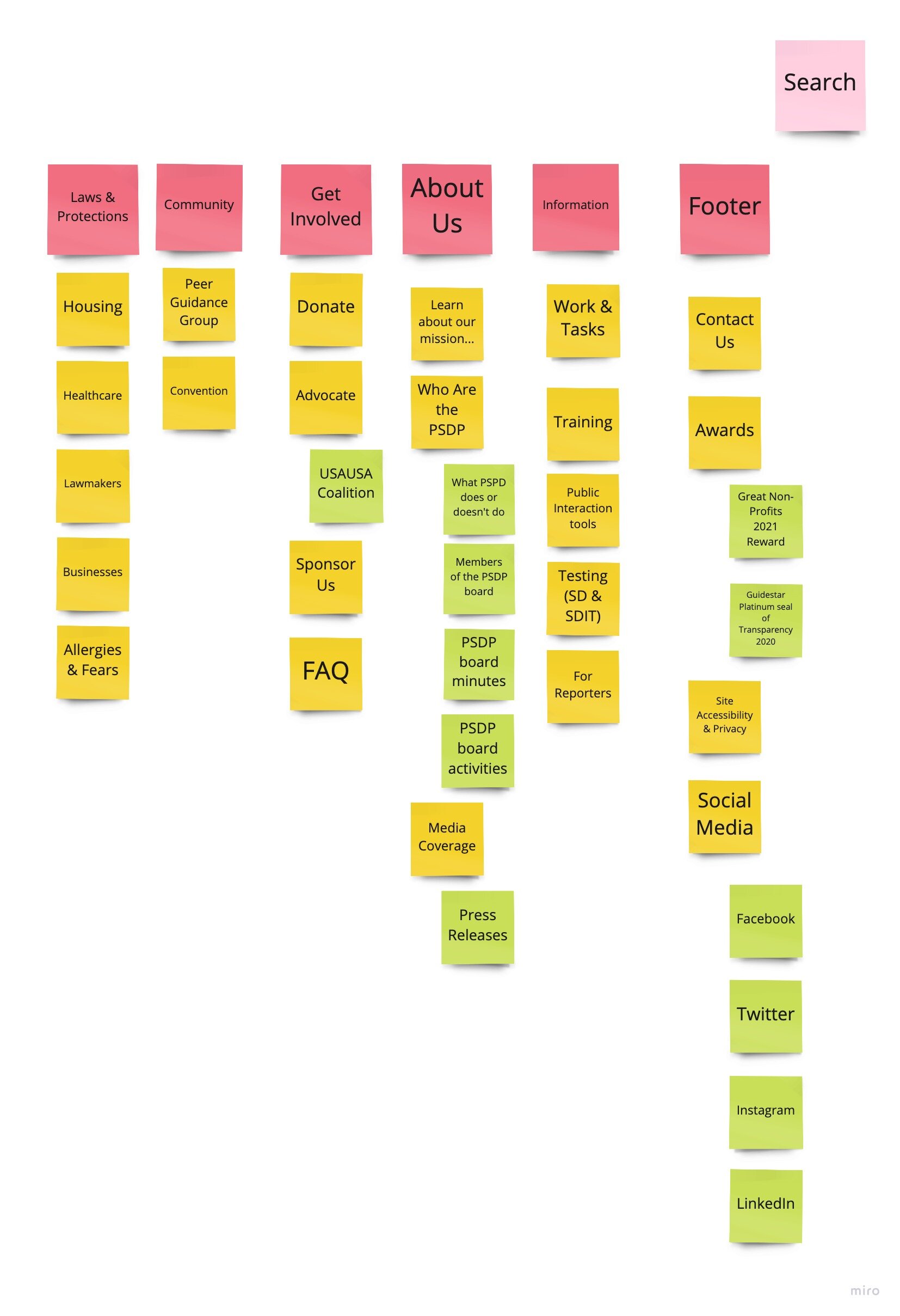
SITE MAP
The Site Map was then finalized after analyzing the overall findings from the Card Sorting:

PROTOTYPING & TESTING
With our Brainstorming session, we discovered good ideas, to move to the next step, which involved creating quick low-fidelity prototypes. I started with sketches, which were transformed to the wireframes v1. After 1st round of user testing, we improved and add corrective to our wireframes.

ITERATIONS & TESTING
After the first round of iterations, our team created the final prototype, but we have more than one idea for some sections of the prototype, so we decided to conduct A/B testing. That is so excited to do this type of testing because all people are different and want to see different staff on the website. Finally, we conducted the testing and made the iterations to the final prototype. The final low-fidelity prototype includes:
Clearer hierarchy;
Rearranged primary buttons;
Increased consistency throughout all pages.
HIGH FIDELITY PROTOTYPE
Based on what we had learned in the user testing, we made alterations to the low-fidelity screens and moved on to the high-fidelity phase. In this, we were going to add a visual layer to our wires and bring the product to life.
STYLE GUIDE

FINAL PROTOTYPES
Based on the defined style guide, we came up with the following high-fidelity screens:


TAKEAWAYS
Constraints
Accessibility and familiarity was key to decision making
Limited micro-interactions and motion
Solutions
Digestible IA
Playful yet simple design
Remained within accessibility guidelines
Future Features
Quick access pocket guide (Mobile)
Live chat (Desktop & Mobile)
