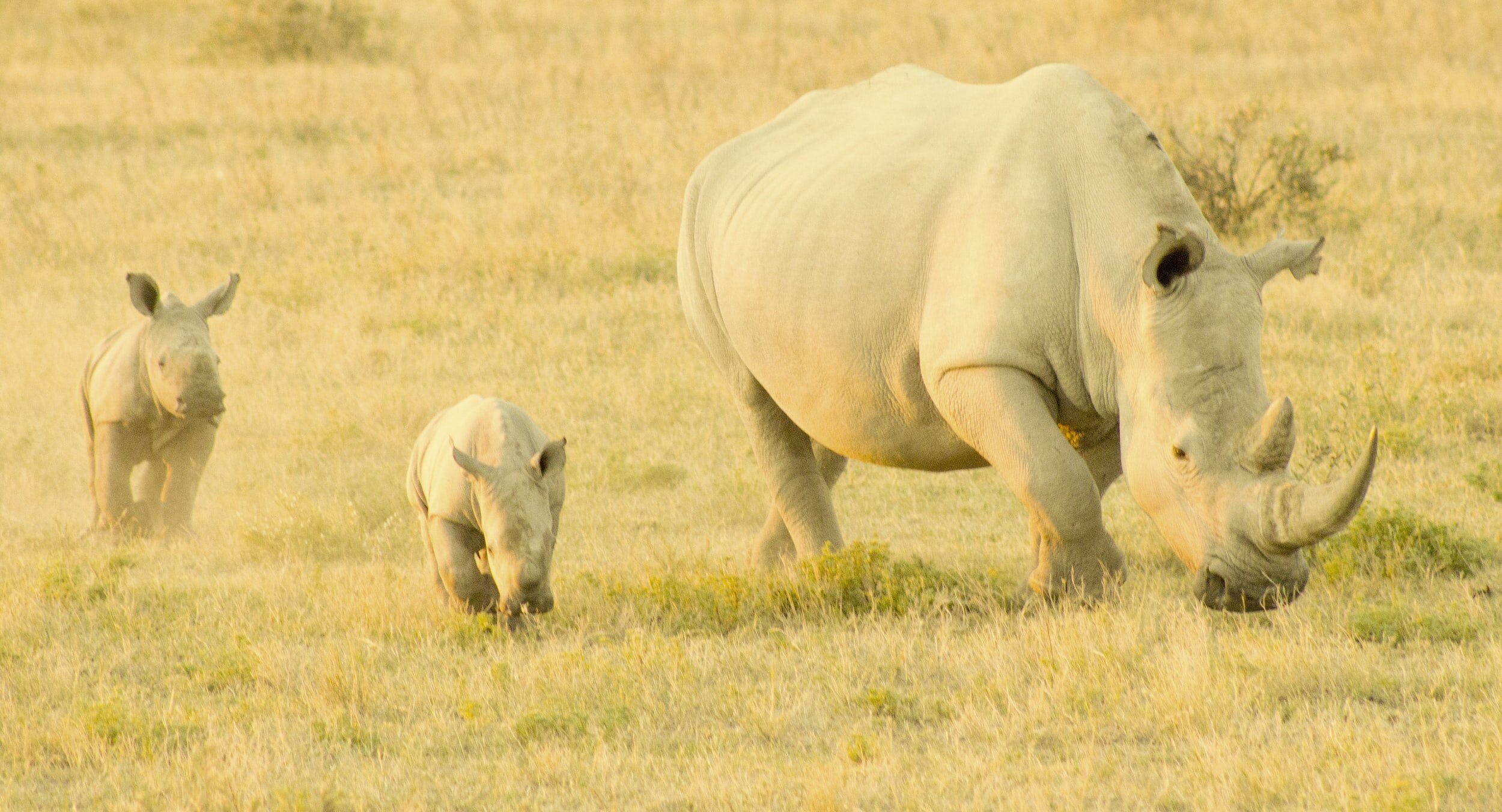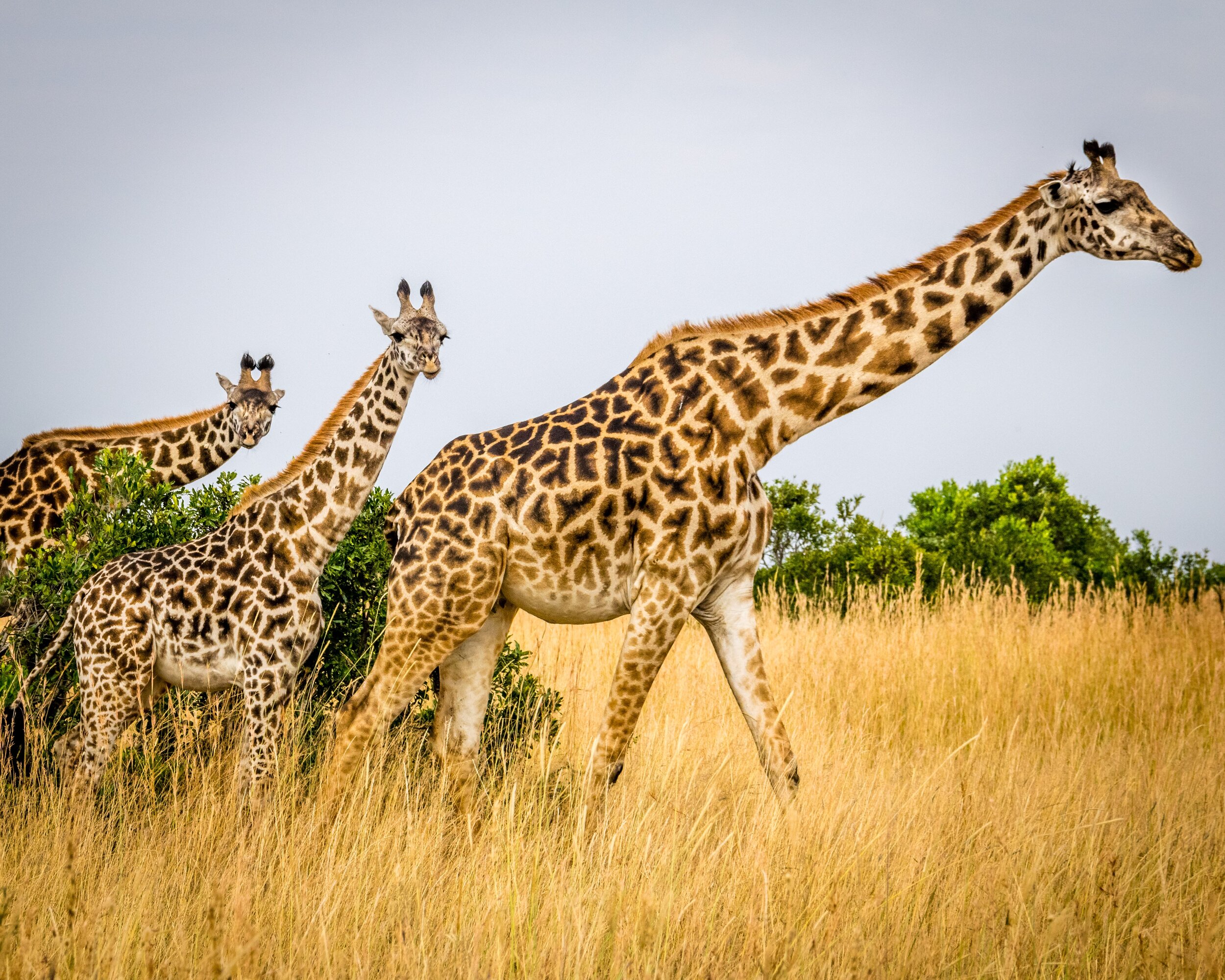
Octagon Wildlife Sanctuary
We’re proud of our successful history saving exotic animals, from birds, to bears, to lions and tigers.
Global Cause Website Redesign
The Problem
Thousands of animals each year are being exploited and mistreated for the sake of human entertainment. When these animals reach an age at which they are no longer beneficial to the “owners” they are often killed or released into the wild, where they cannot sustain themselves. Sanctuaries such as Octagon Wildlife are highly beneficial to help reduce the number of animals who are kept in captivity and reduce suffering by offering the animals the best quality of life for their remaining years.
The Solution
The Octagon Wildlife website does not have a clear organization of information or navigation, which I would like to help improve. With a more user-friendly website, we believe that we can help drive more business and donations.
My Role: UX/UI Designer
Disciplines: User Experience Design (UI/UX), Information Architecture, Interaction Design, Prototyping, Usability Testing
Tools: Adobe XD, Miro, Figma, InVision, GitHub, VS Code
Time: 4 weeks
The Design Process
-
Empasize & Define
-
Ideation
-
Information Architecture
-
Prototyping & Testing
-
UI Design
USER RESEARCH & ANALYSIS
RESEARCH OBJECTIVE
We are conducting this study because we want to learn from people what are their frustrations and knowledge about wild animals located in zoos and places like that against their will. We are re-designing a website whose mission is to rescue exotic animals, these are ones that are 17 to 20-year generations of being born, raised, and sold in captivity to be a "pet" or be used in a business.
HEURISTIC EVALUATION
We kicked off our project by redlining current website heuristic issues. Octagon Wildlife Sanctuary's current website has the following problems:
Issues with visibility of system status;
Not clear hierarchy;
Not a logical navigation menu.
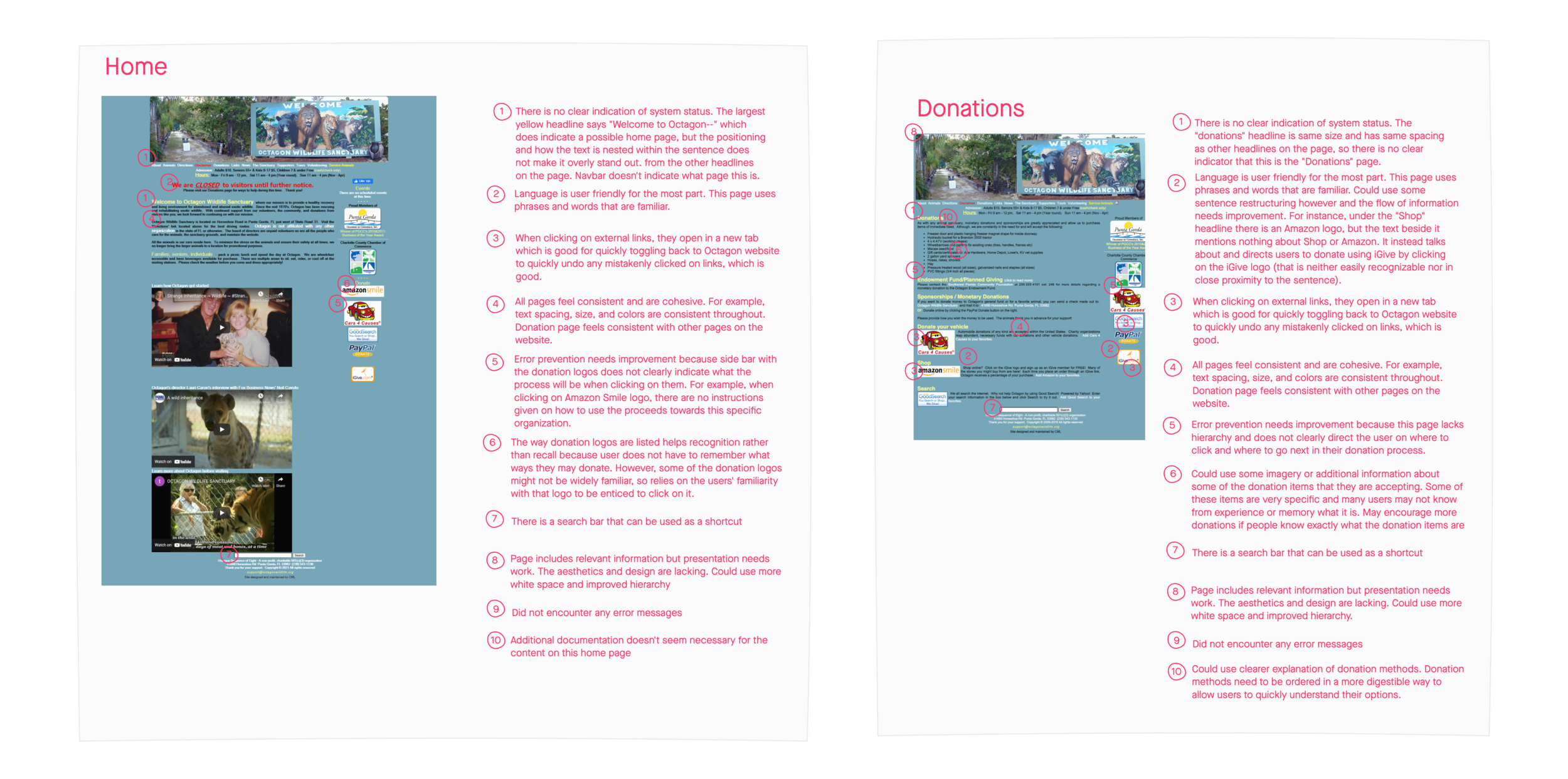
We believe that creating a more digestible web experience for people who love animals will result in a higher number of contributions and interest in the sanctuary.
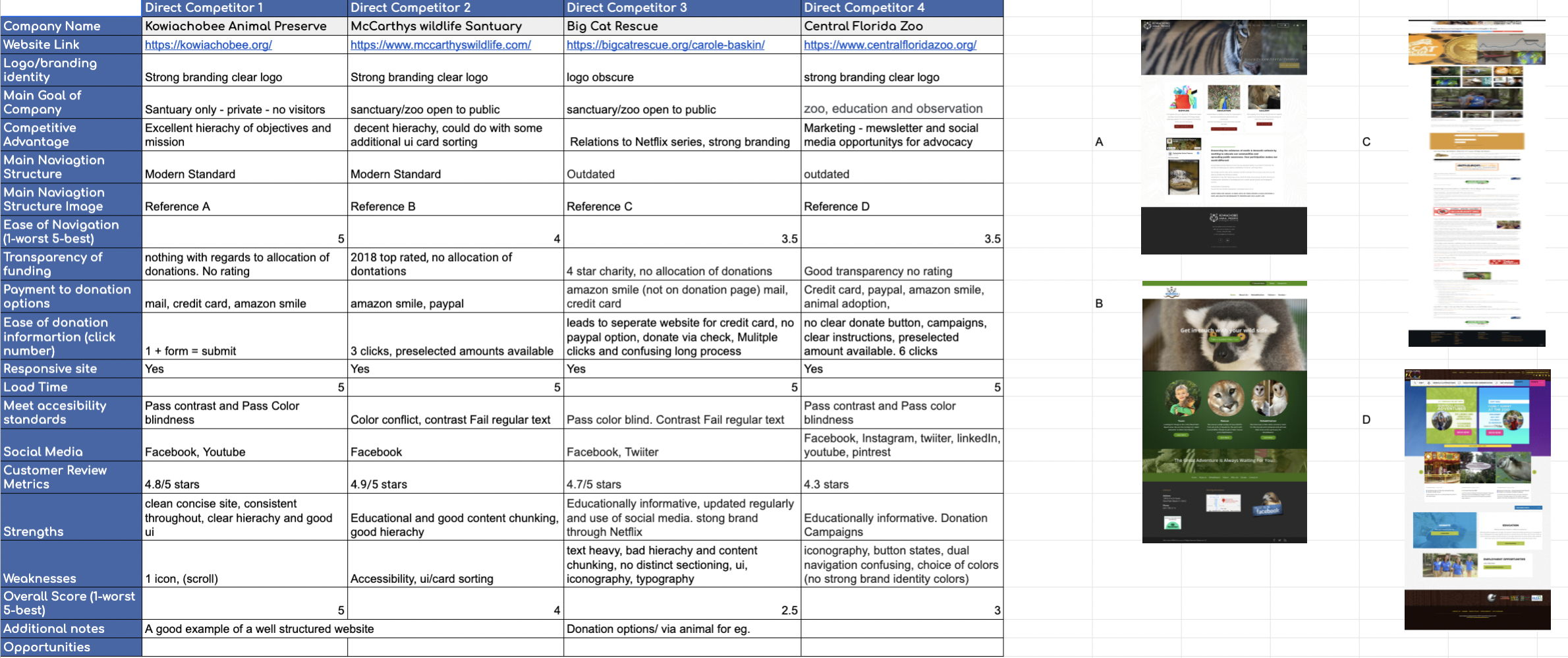
COMPETITOR ANALYSIS
We analyzed Octagon Wildlife Sanctuary’s competition to learn the strongest and weakest parts of the organization and website in general. We found 4 competitors on the market and sorted the findings.
USER INTERVIEWS & DATA ANALYSIS
Our team conducted 5 user interviews to get to know our users better. We defined that the main issue which prevented users from donating to charities was pushiness and a complicated donation process. User needs transparency of the organization, so they can be more trustful to people who use their money. All interviewees know the difference between the sanctuary and zoo, uses social media as the main resource of charity information and wanted to see the report of donated funds. With all this knowledge, we started to create our user persona by combining user insights using the empathy mapping technique.
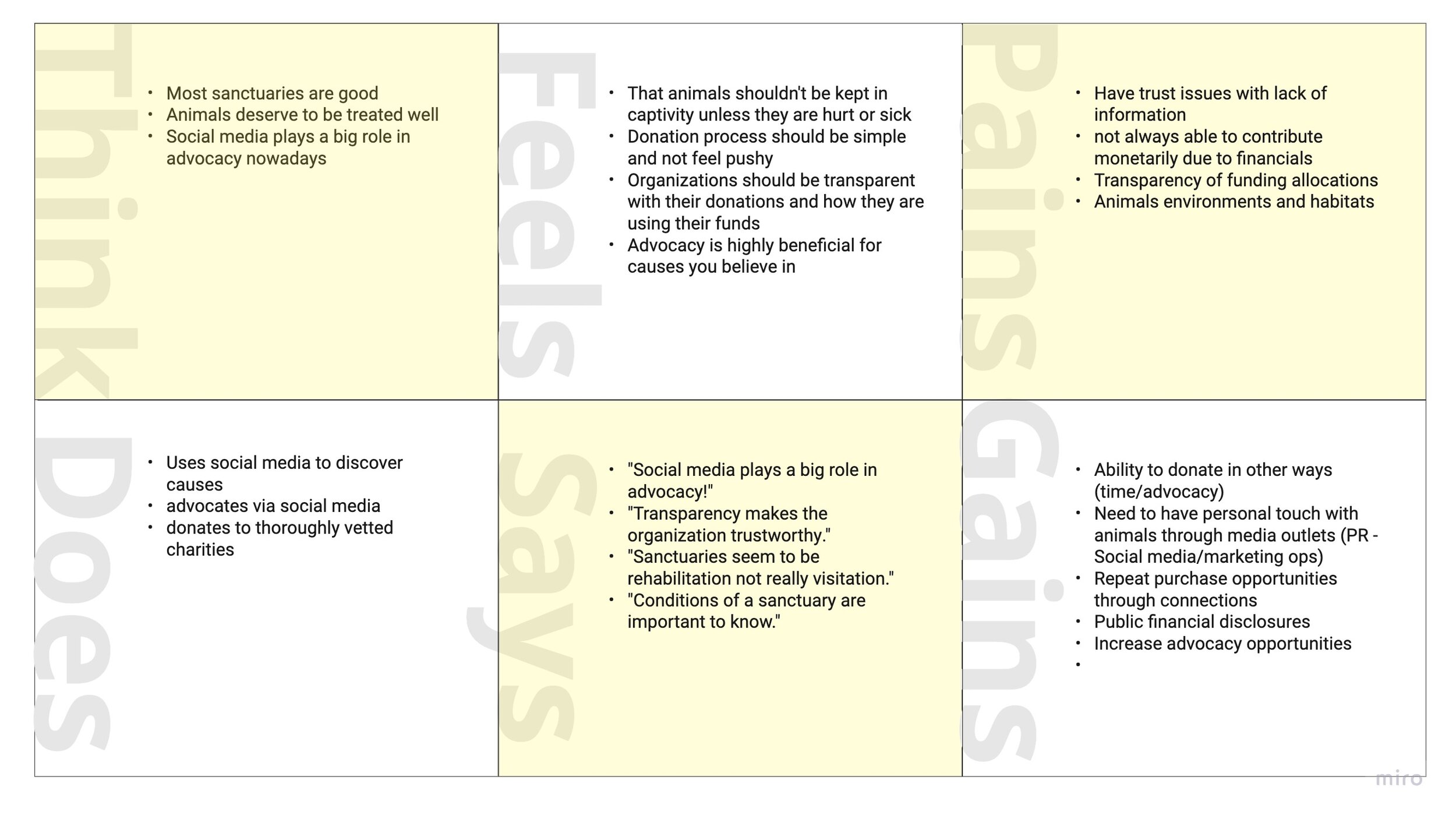
*Empathy Map
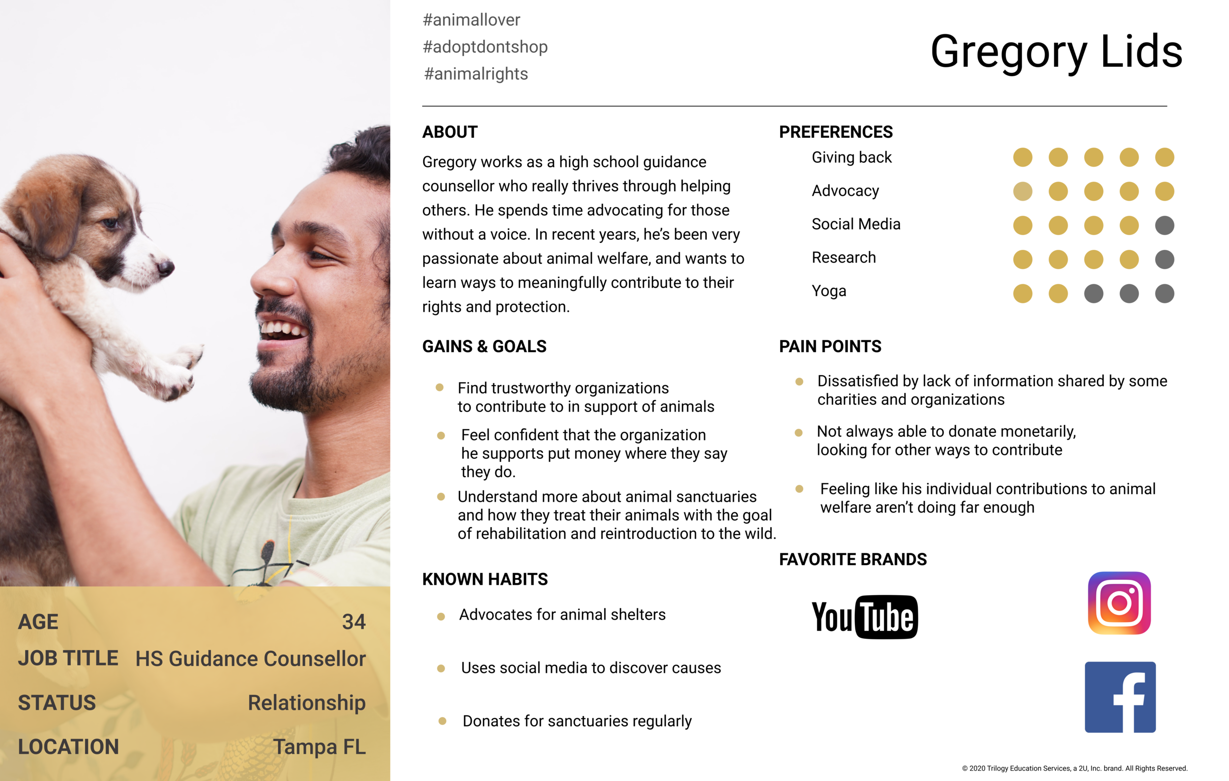
*User Persona
After analyzing research data I defined the problem statement:
Octagon Wildlife Sanctuary's website is the main channel by which the public can be made aware of the problem of wild animal mistreatment as well as the need for support in their rehabilitation through advocacy, donations and volunteerism. We have observed that the current website is not meeting those needs as they are not getting sufficient foot-traffic and support. How might we refine the website with usability heuristics in mind to increase visibility, foot traffic, and donations to the sanctuary?
IDEATION & BRAINSTORMING
USER SCENARIO
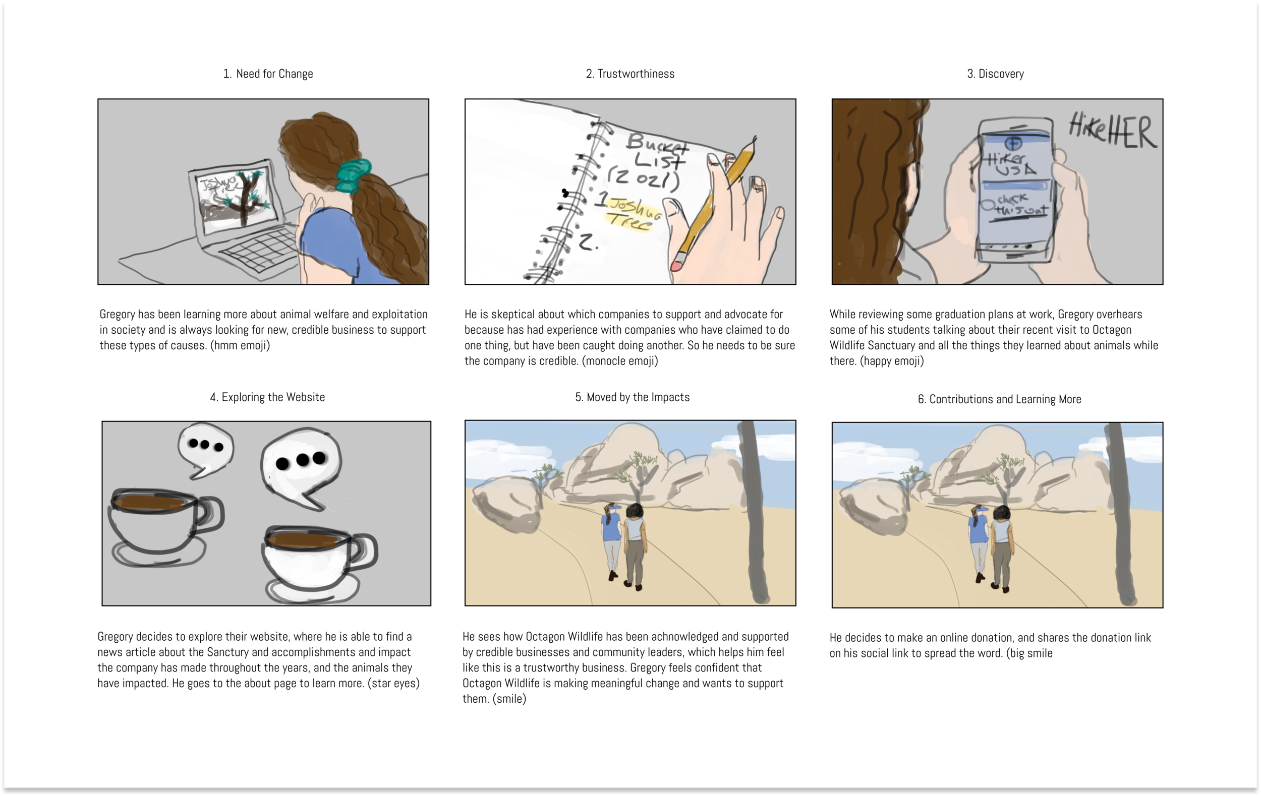
Gregory learned about Octagon Wildlife Sanctuary through some of his students. He thought it sounded like a good organization, so decided to visit their website to learn more. After reading about the sanctuary and the impact they’ve made over the years, Gregory decides to make a donation.
STORYBOARD
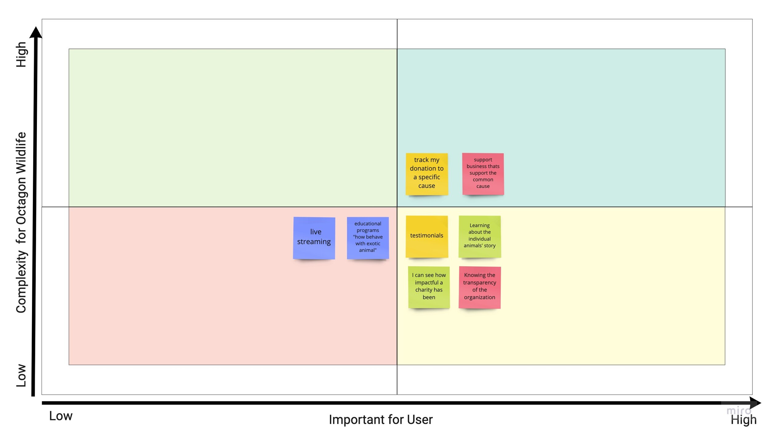
FEATURE PRIORITIZATION MATRIX
We analyzed user research data and conducted team ideation and brainstorming session. We started with “I Like, I Wish, What If Method”, then voted on the best brainstorming ideas and, finally, converted our thoughts to the Feature Prioritization Matrix.
INFORMATION ARCHITECHTURE
CARD SORTING
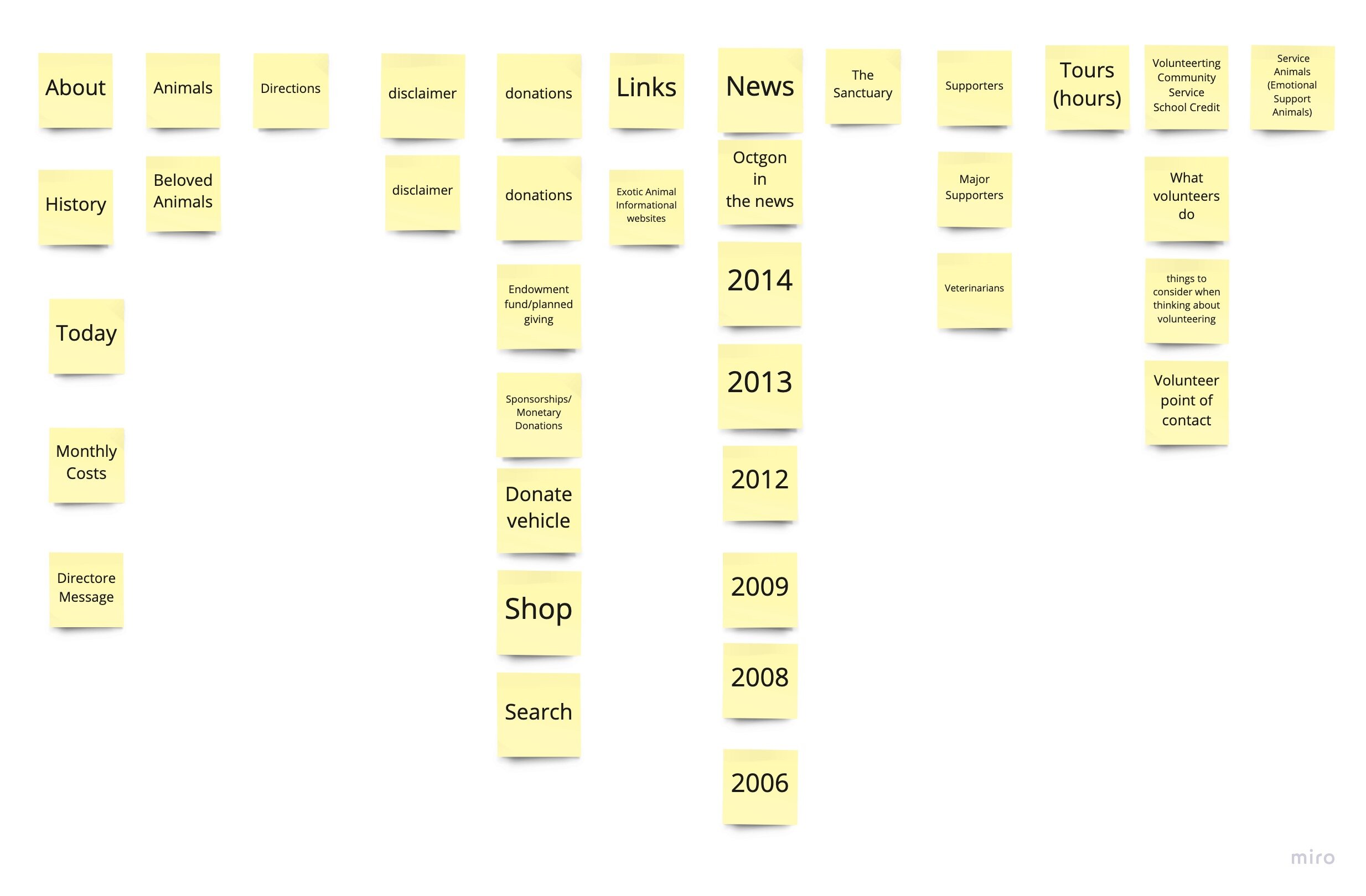
The main purpose of the redesign is to improve the information architecture of the website, we conducted the Card Sorting study to simplify and make more clear navigation items. We created 37 cards to be sorted into categories.
*Step 1: Define
*Step 2: Group
*Step 3: Structure
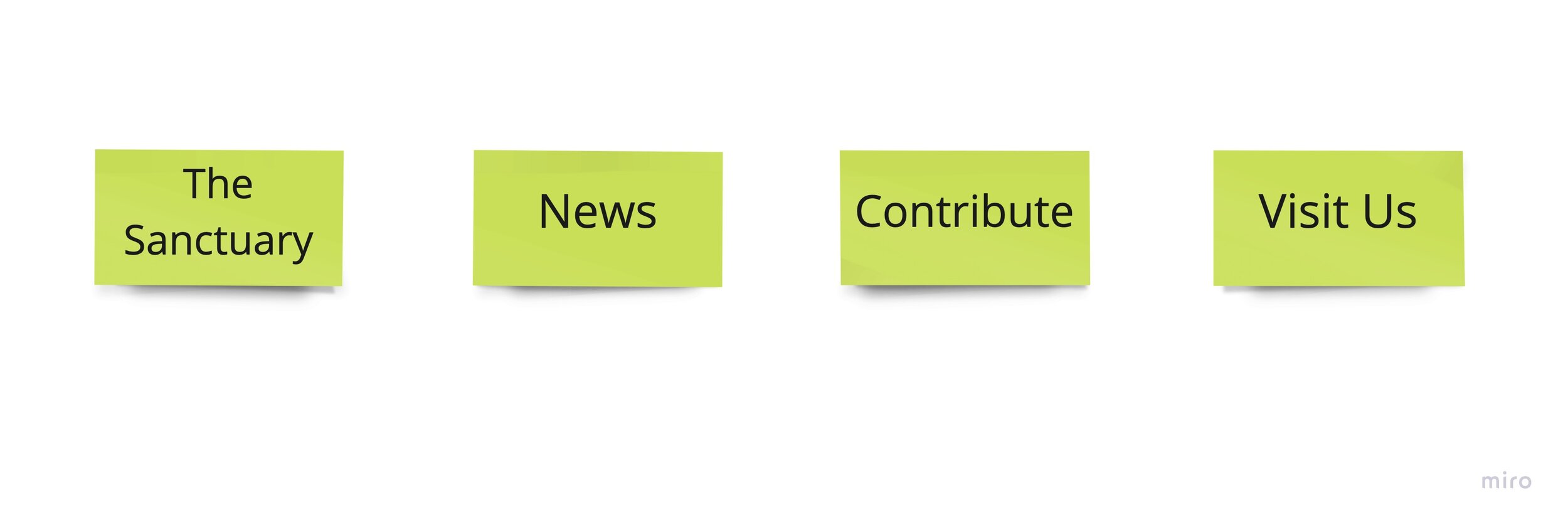
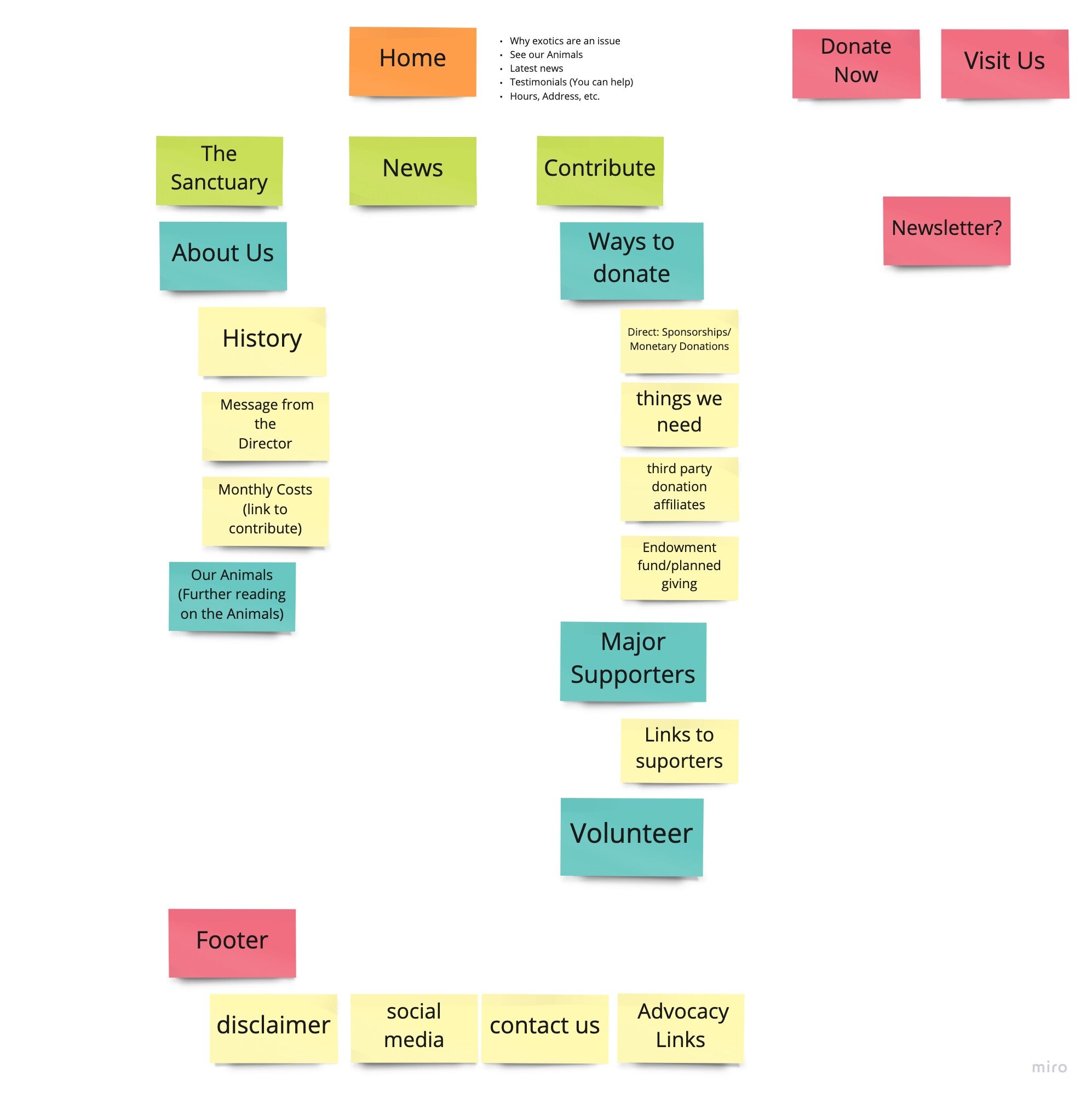
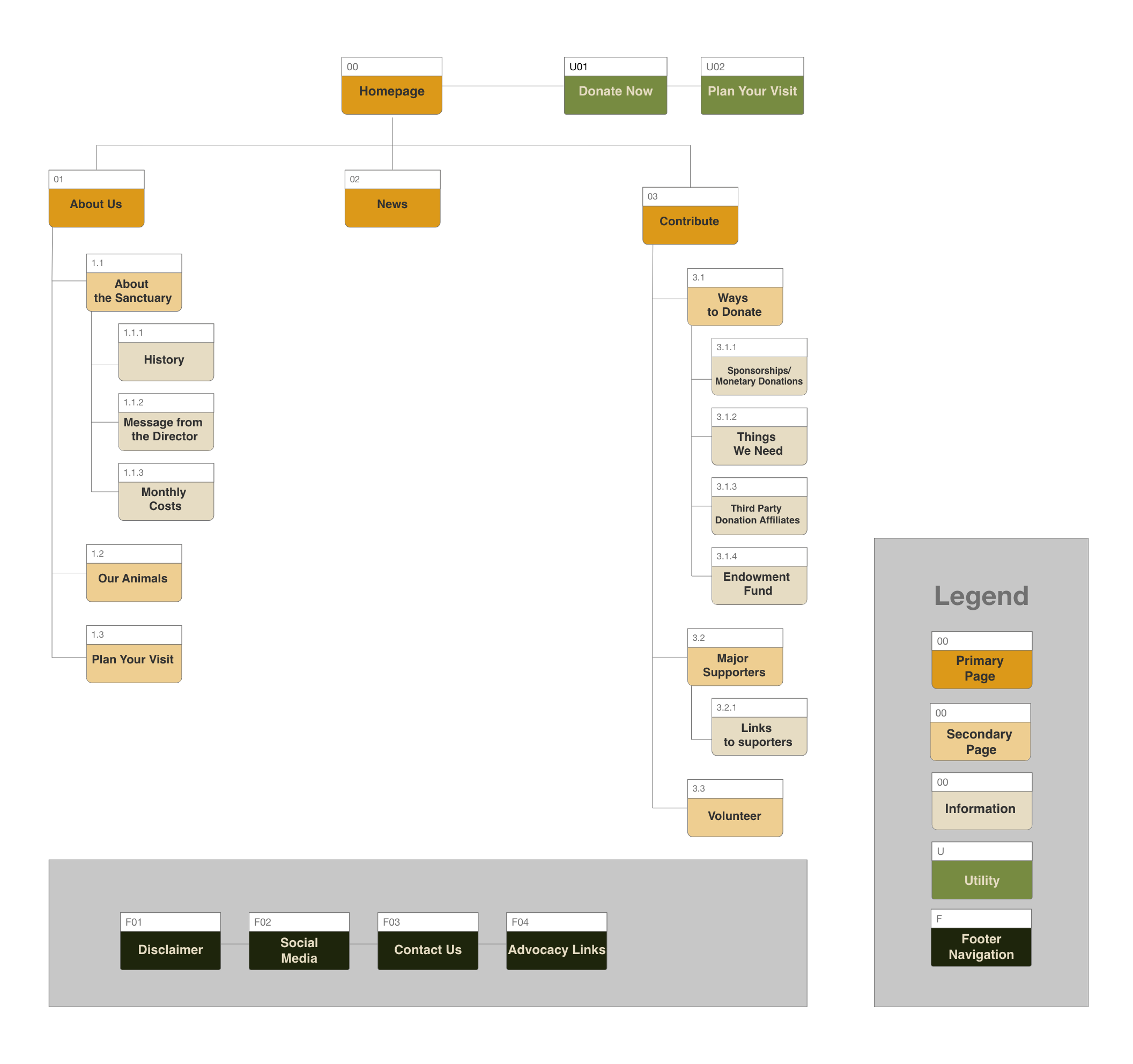
SITE MAP
Whilst analyzing the original site map we found it overbearing, with 12 tabs, no clear indication of where on the site we were and a lack of hierarchy on its pages, it was very stressful to navigate and not an enjoyable experience. So after many iterations, we simplified the site map to the one seen here. Combining content that is related to one another into an easy-to-navigate website. The Site Map was finalized after analyzing the overall findings from the Card Sorting.
PROTOTYPING & TESTING
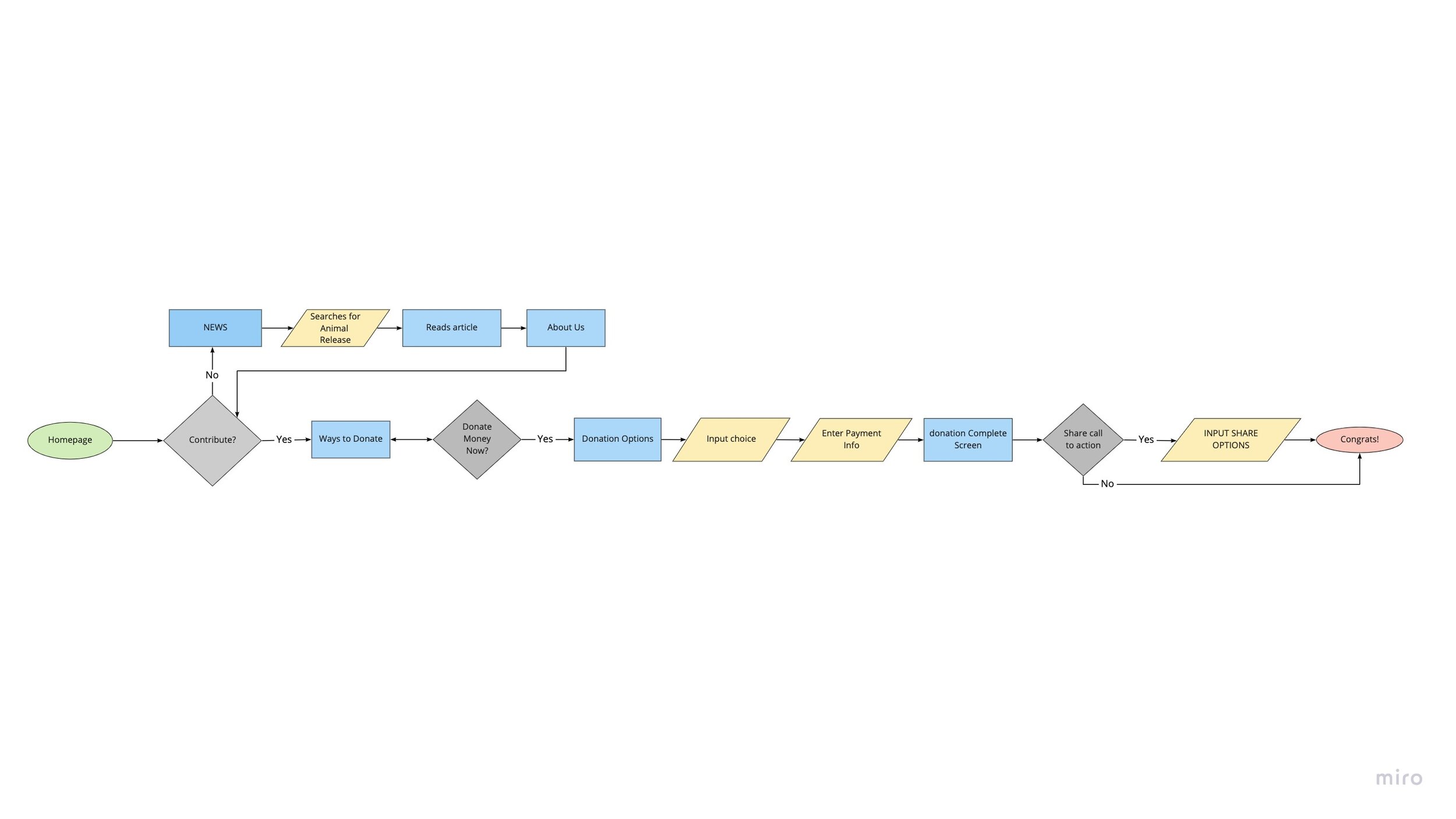
USER FLOW
Our user flow is an amalgamation of Gregory, our user Persona, and the culmination of our site mapping. Gregory takes the happy path from the homepage through donating, which is the site’s primary goal. If he needs additional information prior to contributing, he can circle back through news and information before donating. And he is greeted with a presage that reminds him to share what he’s learned. Our areas of focus were - make donations easy, provide information, and motivate advocacy.
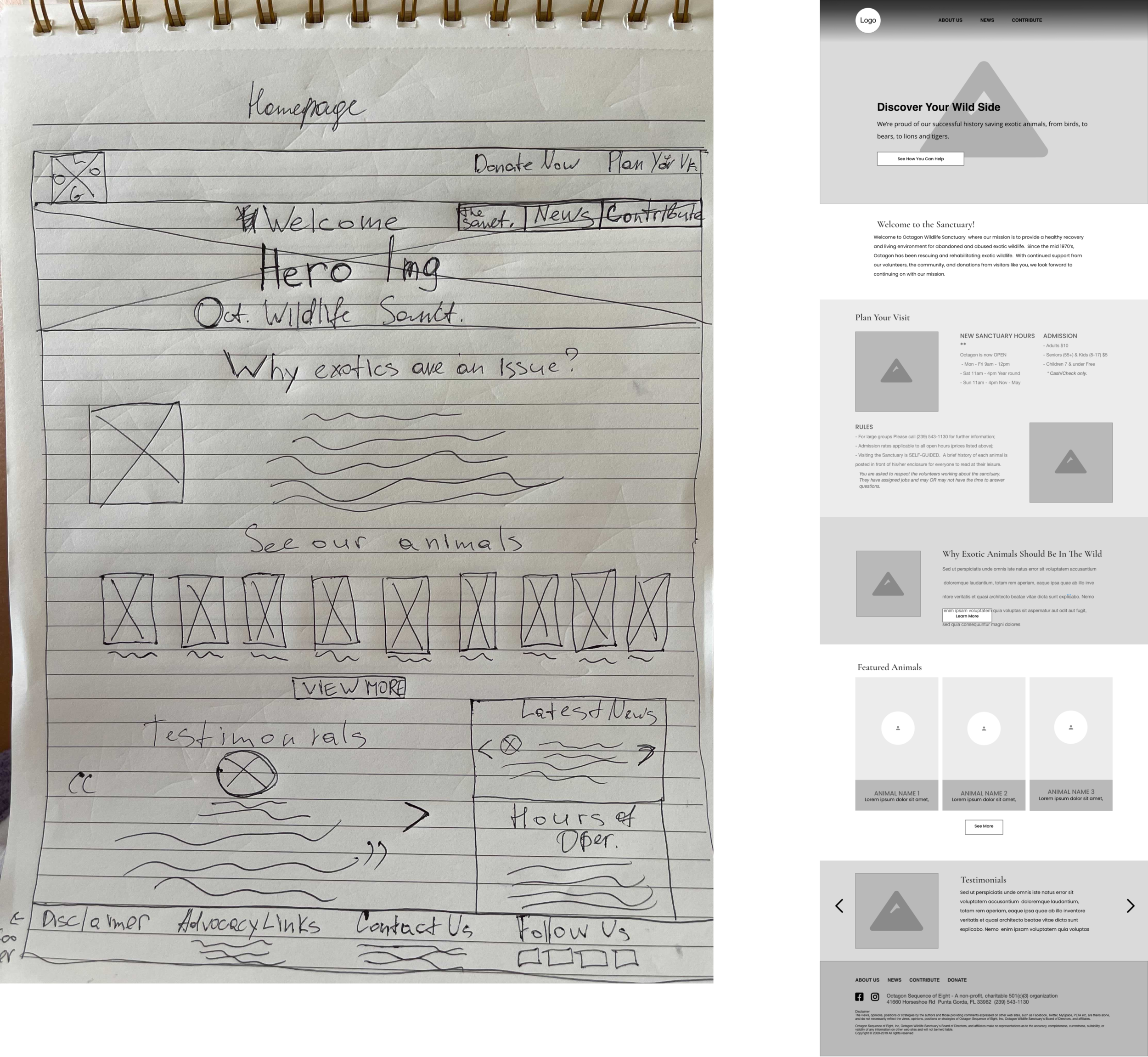
SKETHCES & LOW-FIDELITY PROTOTYPE
With our user flow in mind, we kept the donating process simple, ensured that we employed usability heuristics to ensure that the information users wanted was easy to find, and made sure that there was an overarching reminder to advocate, especially after donating.
We completed 4 rounds of user testing including the A/B testing. We want to learn if users can easily discover the content that will motivate them to visit and/or donate to the Sanctuary.
UI DESIGN
After thorough user testing, we made improvements to the prototypes and then started building the high-fidelity digital prototype. We made use of Adobe XD App for the designs and prototyping.
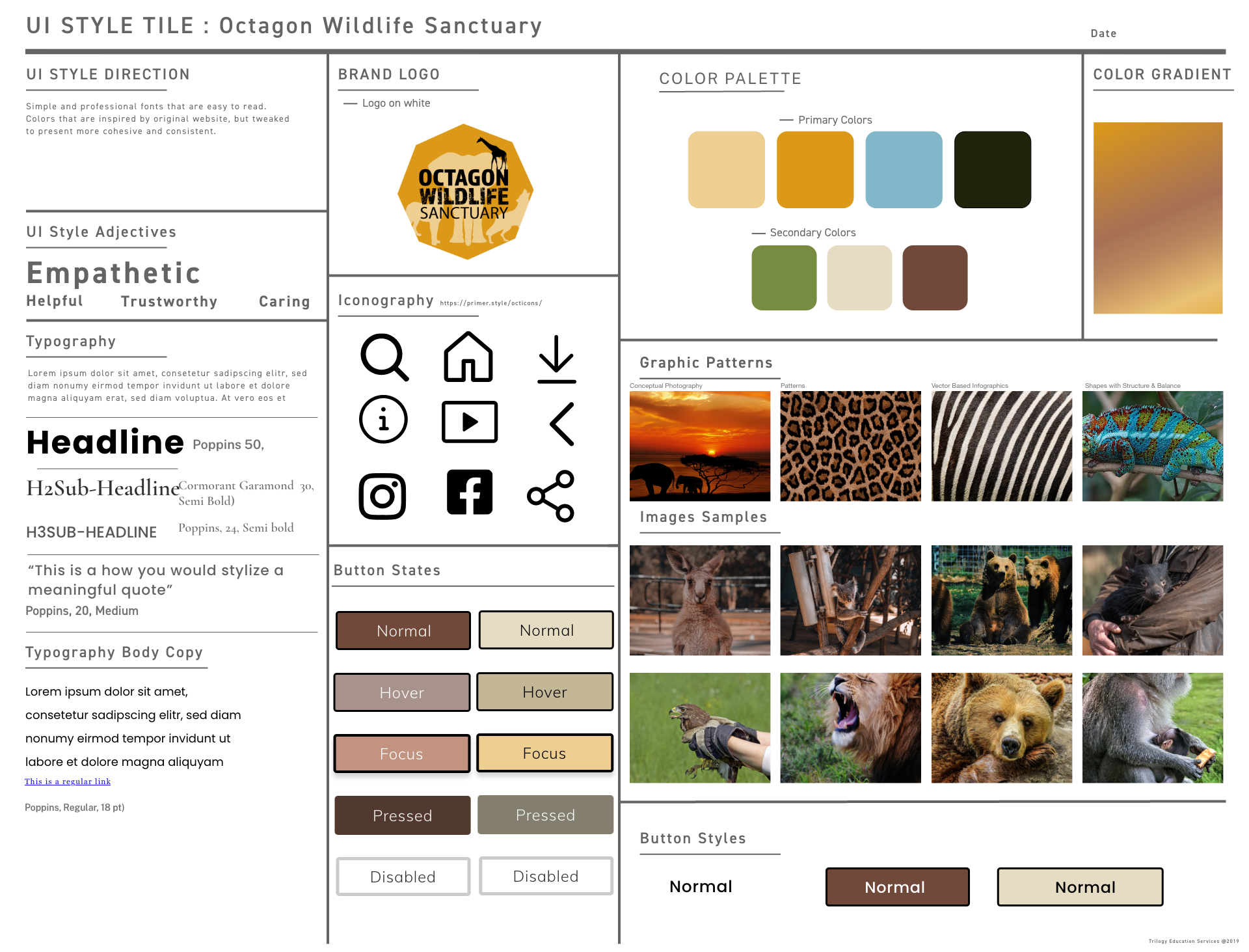
STYLE GUIDE
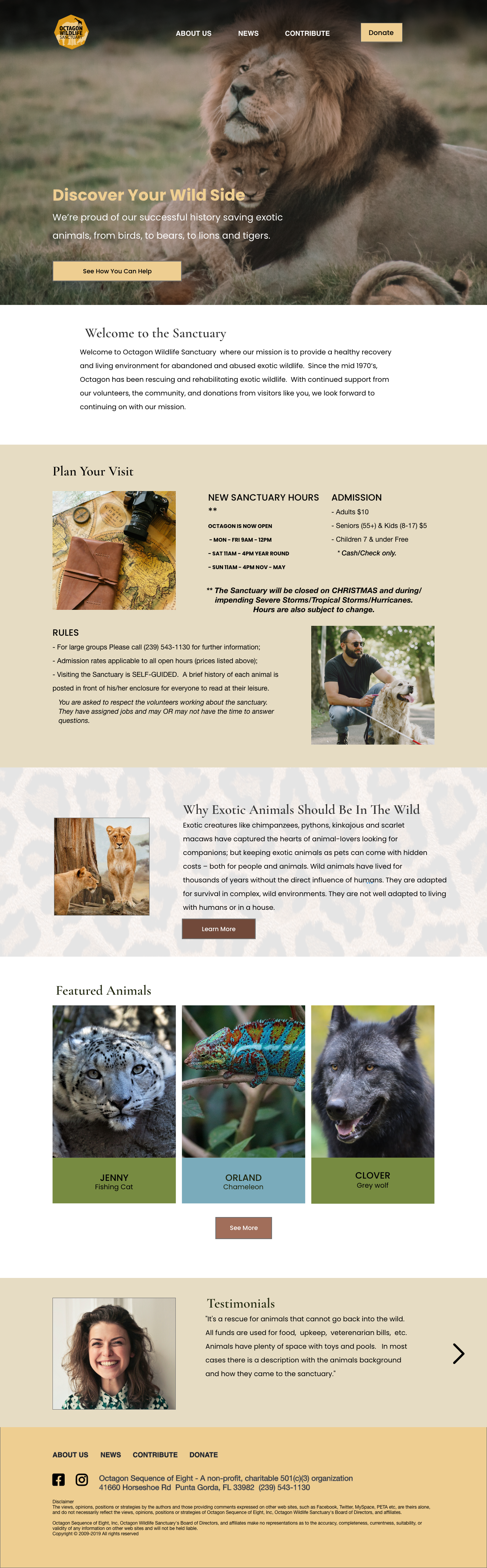
HIGH-FIDELITY PROTOTYPE
Based on the defined style guide, we came up with the following high-fidelity screens.
TAKEAWAYS
The Octagon Wildlife Sanctuary redesign project was a great journey focused on designing digital interfaces from a user-centered perspective. The entire user-centered design lifecycle was covered in this project, from the User Research to conceptualizing Prototypes and then refining them through User Testing in an iterative fashion.